SimEx-Iwerks
Entertainment
Corporate Website Redesign
Web Design • UX Design • Entertainment Website • 2018
SimEx-Iwerks is at the forefront of creating cinematic attractions and providing a diverse portfolio of immersive films for a wide range of family destinations. They work with theme parks, zoos, and aquariums, captivating guests and maximizing revenue.
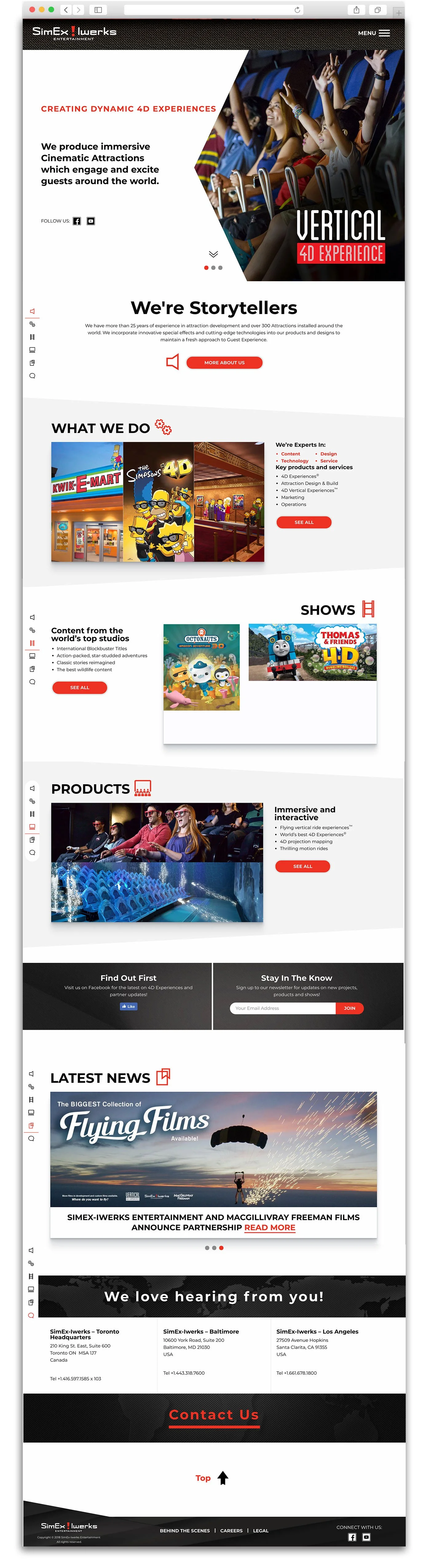
In 2018, I led a full redesign of the corporate website, transforming it from a dated, clunky platform into a sleek, interactive, and engaging digital experience.
The Process
User Research
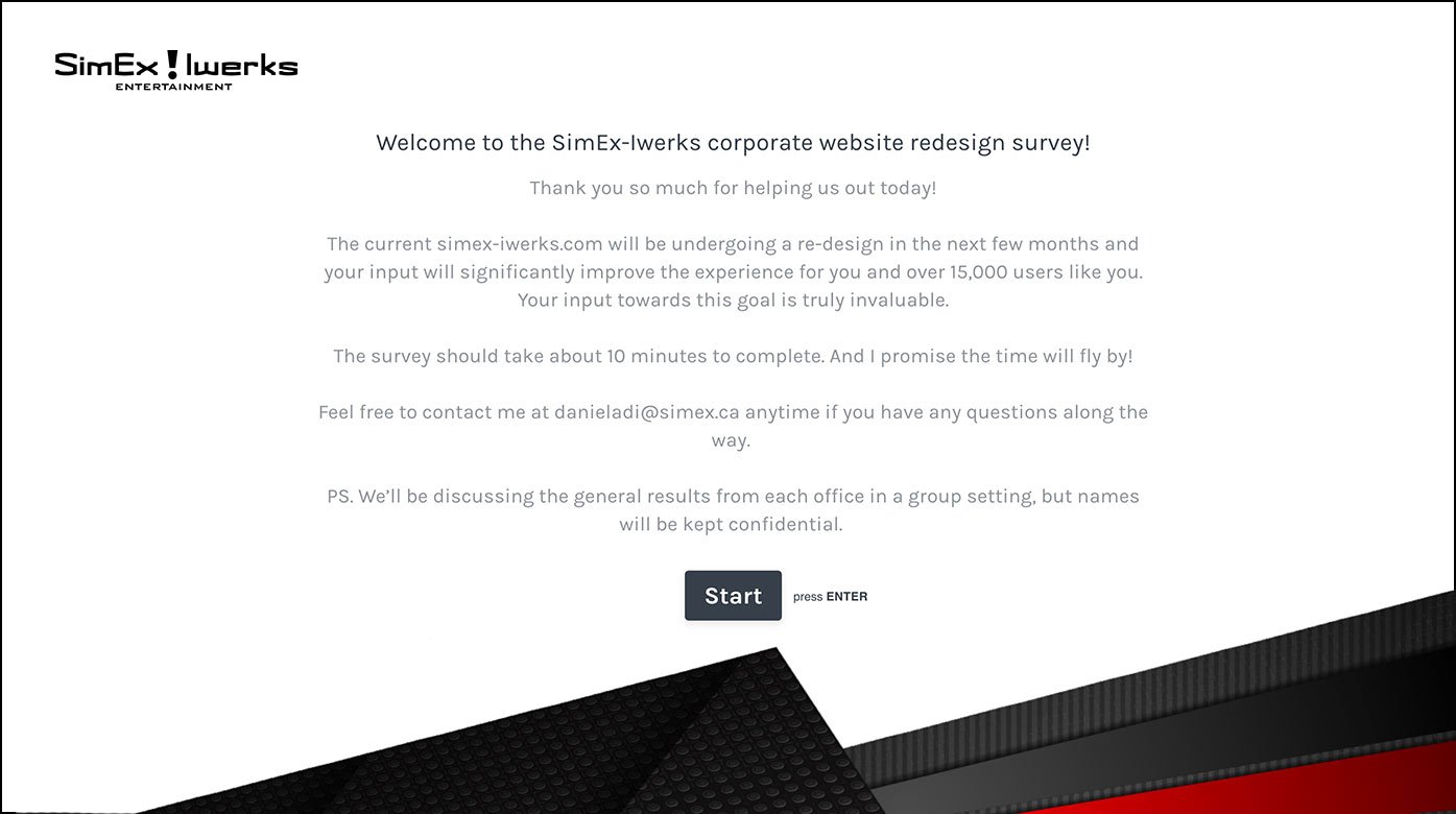
I conducted stakeholder research with VPs and decision-makers across SimEx's three office locations (LA, Baltimore, Toronto) through structured questionnaires.
This research gathered insights on current website pain points and expectations for the redesign, ensuring the project aligned with organizational goals across all regions.
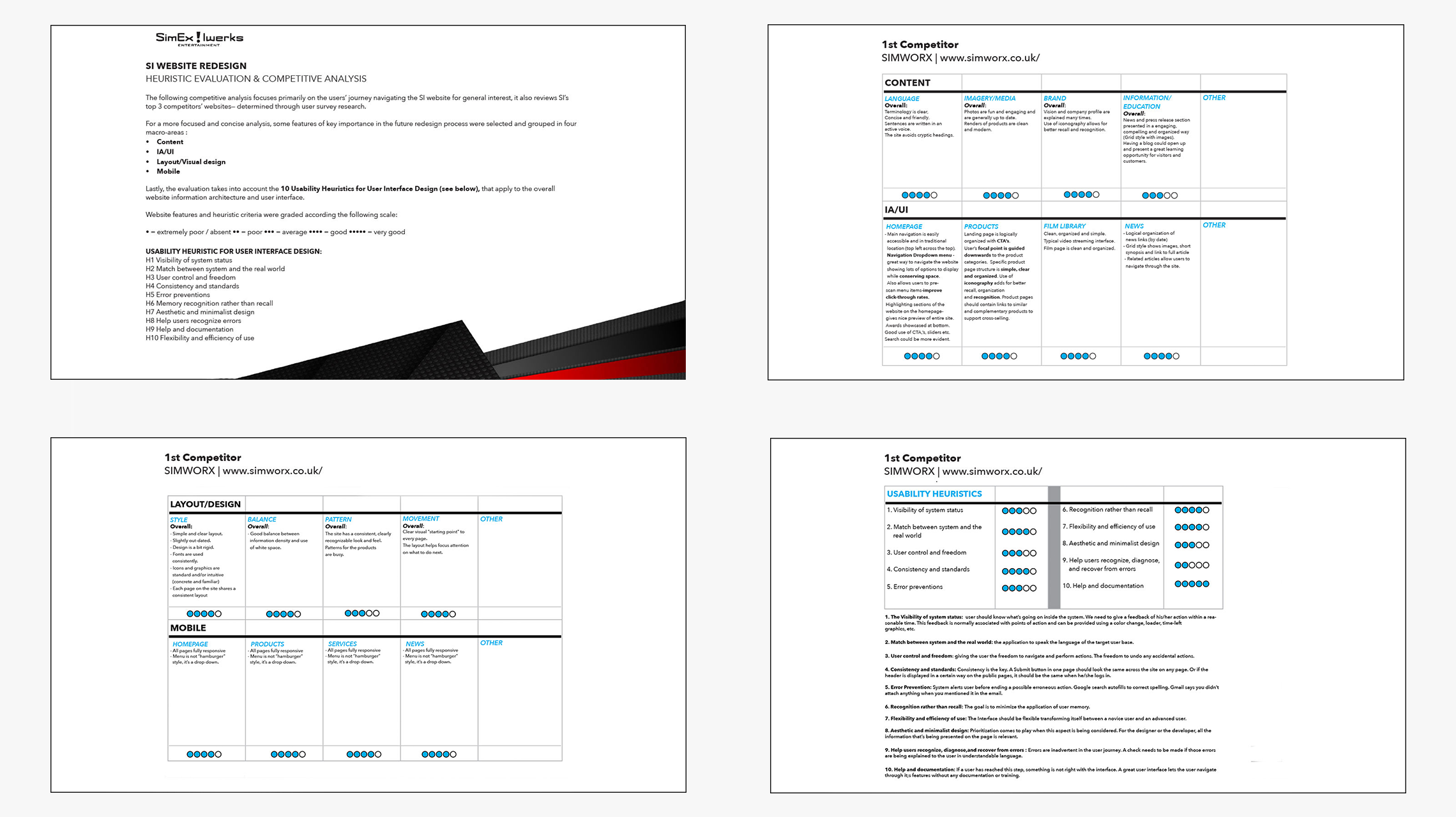
Heuristic Evaluation
Using Nielsen Norman Group's usability heuristics, I conducted a systematic evaluation of the current website, identifying key issues in:
Match between system and real world – ensuring terminology and concepts align with user expectations
Consistency and standards – maintaining design patterns and conventions throughout
Aesthetic and minimalist design – removing unnecessary elements that could distract from core tasks
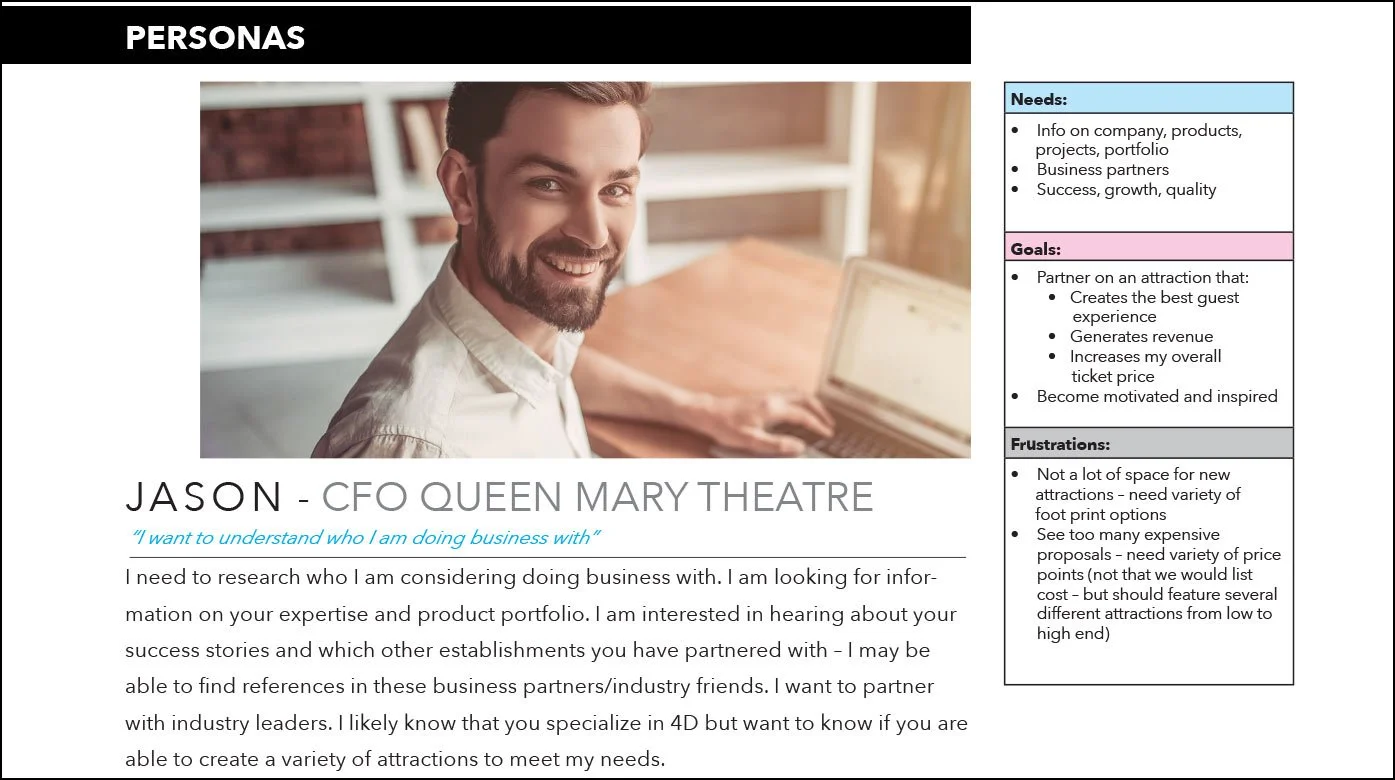
Personas
To guide the website redesign and feature prioritization, I developed user personas based on stakeholder interviews and analytics.
The primary user type emerged as B2B Decision-Makers; VPs, marketing directors, and corporate stakeholders who evaluate experiential marketing vendors for large-scale projects and attractions.
These users research multiple vendors simultaneously, need quick access to
portfolio work and capabilities, and require clear pathways to initiate project
discussions across SimEx's three office locations.
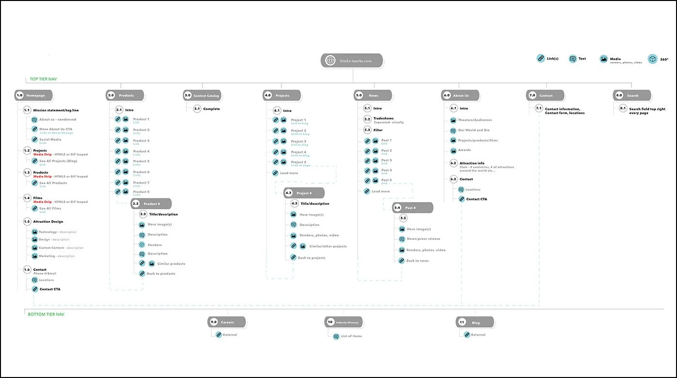
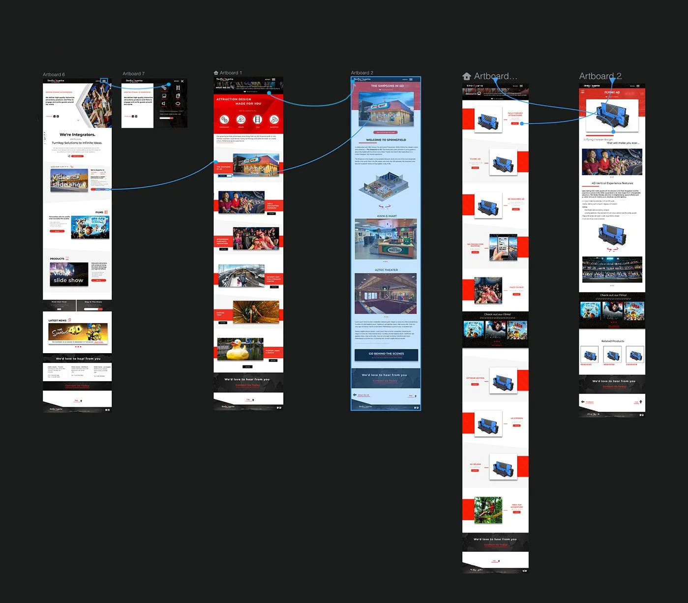
Site Maps and Wireframes
The first step of combining all those features into something that makes sense was a sitemap that shows all the screens that make up the website and how they are connected.
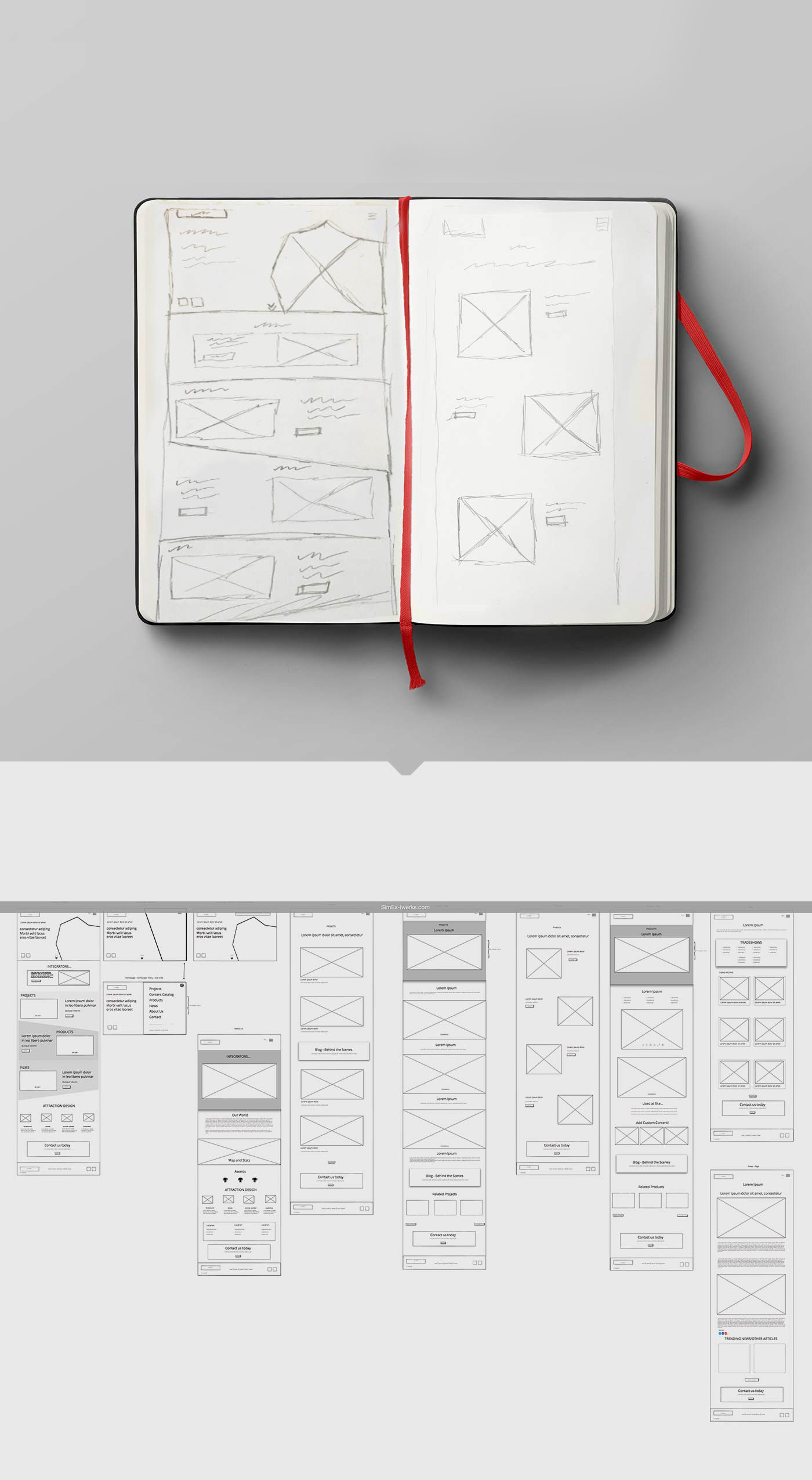
After the first iteration of the sitemap was complete, it was time to start exploring the flow on a screen-by-screen basis, using wireframes. I had a pretty clear vision for what I wanted the website to be like, so I first did a rough sketch, then created more detailed wireframes.
High-Fidelity - Prototyping
After the flow was defined it was time to validate the designs, so I decided to go ahead and create the high fidelity designs and a prototype.
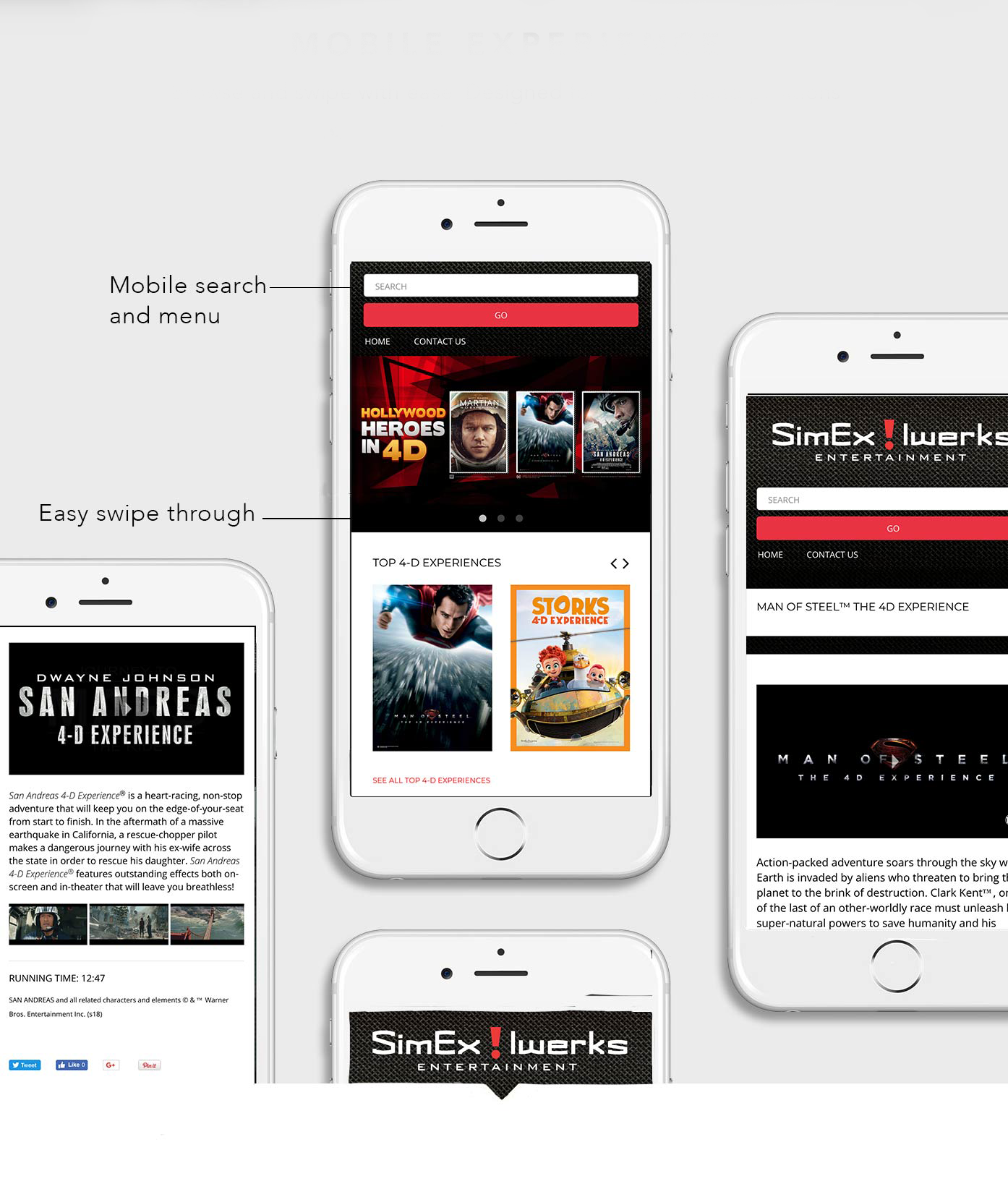
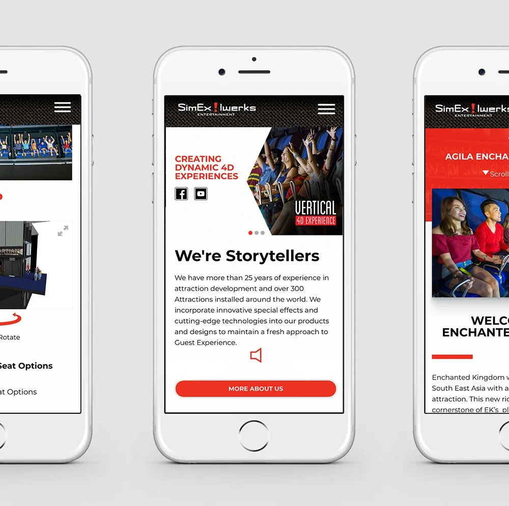
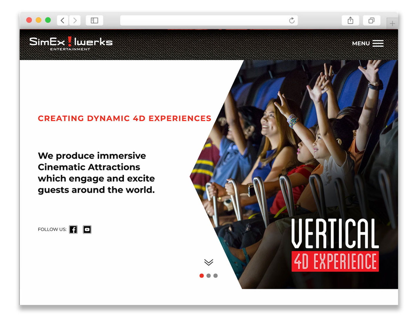
Final Product